VASTU ARTICLES
Choosing Paint Colours
Color is the most powerful decorating element in our homes. Color is memorable and above all personal. An understanding of color can really help us achieve the goal of a pleasant, personal and comfortable home.
There are hundreds of options but only one decision maker, that matters and that is You. The people who eat and sleep, entertain, play and rejuvenate in the spaces are the ones whose well-being is affected.
If we understand the basics of the color, then we can make a perfect color scheme.
The colors are divided into three categories-
Primary color- These are the three basic hues, red, blue and yellow. They are the foundation of the color wheeland all other colors are derived from them.
Secondary color- When two primary colors are mixed, they form a secondary color. They are orange, green and violet.
Tertiary color- When two secondary colors are mixed, they form a tertiary color, like citron, olive, russet.
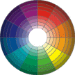
THE COLOR WHEEL- The color wheel is a complete picture of all the colors available, once youunderstand this, there will not be any problem in forming any color scheme. In the color wheel at the ri ght, the primaries form a triangle with equal sides with in the circle , and the secondaries form another triangle opposite to that. Each color has a 'complement’ which is located directly across from it on the wheel. Thus, green is complement of red, orange is complement of blue.
A perfectly balanced color scheme might use equal parts of three colors which are equidistant on the color wheel. Interior designers often compensate for intensity by either tinting (adding white) or toning (adding black) or by graying (adding complementary colors). In these way they create contrast through a change in value (lightness and darkness) or intensity (brightness and dullness). With even this limited information, it is easy to see how the possibilities for combining colors are infinite and inviting. Using the tints and tones, the total effect is lively and pleasing but not overwhelming, a beautifully colored room. Now here are some of the colors with their effects and the nature they depict and the places where they are suggested to use.
RED : Red is the most dramatic, emotional and active of the three primaries . It is an especially versatile color in its effects, enlivening interior spaces by creating excitement, warmth and elegance. The use of red suggests a bold and confident attitude. It is used in those areas where one needs excitement like the bars. It is less often used in sleeping area because of its energizing quality. The complement of red is green.
BLUE : Blue is the only colors which is the most universally equated with the beauty. Blue is timeless, linking the present with tradition and lasting values. It is the most versatile in expressive values. Psychologically, blue is associated with tranquility and contentment. In interior design, softer and lighter blues are generally preferred for the larger areas.
YELLOW : It is a powerful color, both light in value and extremely intense in its purest form. It evokes a sense of energy and excitement. Yellow is a perennial favourite in interior design, combining with greens to provide the natural freshness and with red for gaiety and richness.
GREEN : Green is the most common choice of the designers. It is often used as a dominant room color. Green goes with every other color and makes it a natural neutral. It represents the greenery of the nature and thus provide the room with liveliness.
VIOLET : It seems to be a color of emotional contrasts. Its paler tints are unabashedly romantic, fragile and quiet feminine. It enjoyed the popularity in the Victorian era and now as pure colors emerge again, beautiful violet is certain to be a player.
ORANGE : It is amazingly versatile, capable of emitting great energy in its purest form and as an earth tone, it evokes warmth, comfort and reassurance. Nowadays, the lighter orange, popularly known as peach is common in use as it gives a cool effect.
PASTELS : Pastels are simply lighter tints of any hue, white added to red yields pink and light pink is a pastel. There is not any particular definition for a pastel color but when colors become so light that they almost seem to be white, they are pastels. The pastels are becoming more and more popular as they crate the most sober and elegant look.
NEUTRALS : Using neutrals does not mean not using color. Any low intensity color that is used as a background for other accent colors, features, furniture and objects in a space can be classified as neutrals. Neutrals are practical and by changing accessories and fabrics the look of space can be dramatically altered against the same neutral background.
Enjoy color, take these tips from the professionals and then you can become creative. You must think about the people in your home who matter the most for you and then imagine the things you do together and then finally go for a final color scheme.
Color has a profound effect on our mood. In clothing, interiors, landscape and even natural light, a color can change mood from sad to happy, from confusion to intelligence, from fear to confidence. Particular colors have different effects on each individual. Response to a color may be influenced by a number of factors such as the body's need for a specific color, a sad or happy memory associated with a color.
In previous decades, certain colors or group of colors dominated every palette. Now in millennium, the stopper is out and uniqueness and personal preferences are really in. There are no absolutes in the world of color. Some colors make you want to get out of your chair, others make you want to nestle down and read. Some colors are articulate and must be listened to. Others are very quiet. Some colors indicate that you have traveled or are well read. Yet others create a desire for closeness , intimacy and love. Following are some of the most typical responses to various color groups.
Nurturing Neutrals
These colors create a sense of peace and well being. They foster quiet conversation with family and friends and can dispel loneliness. Throughout time, mankind has found a sense of peace and tranquility when in touch with "Mother Earth". It follows that colors which impart a sense of warmth and serenity come directly from the earth. In addition to the earth colors in the neutral group are colors associated with sea such as sand, shell, coral, pearl, stone, seaweed. GREEN is a color which helps us to adjust to new environments and situations. It will always be found among the 'nurturing neutrals'. The BLUES represented here will range from winter sky to stream to midnight. The neutrals are somewhat like the furniture while other palettes are more like accents or accessories.Intellectual Colors
These are the sharp, witty and unique colors which convey a message that the owner has traveled, is well read and has something to say. These colors will command respect without being overbearing. This palette also starts with a earthy, warm base. Gray is a color which promotes creativity and will often be found in foundation of an intellectual palette. These grays will be warm and gentle. Some tones of blue suggest communication and trust, so it will naturally be found in the intellectual palette. Navy blues will often find their way in this palette, but it's effect is warm and never cold and fragile. Red also appears in this intellectual palette, but the shades will be earthy and complicated burgundy, cranberry.Playful Colors
These colors are exiting and used for a fun providing environment These playful , whimsical palettes create their own kind of music, like the sounds of children playing. There are highs and lows, lights and darks and always movement andactivity. Use d in active spaces within the home, a 'playful' palette can add energy and vitality. But if overdone, this type of palette becomes irritating and stressful. The foundation of this palette is WHITE. This could be anywhere from vanilla ice cream to snow drift to winter moon. Then comes the bubble gum pink, buttercup, wintergreen, all the berry colors and crayon colors. Many of these colors will be cool, and even in lighter tones there will be brightness and clarity. The bottom line in creating this type of palette is that the colors should suggest a sense of freedom, play and downright fun.Healing Colors
This palette includes the colors which are very refreshing and rejuvenating. Like nurturing colors, 'healing colors' also begin by getting in touch with nature. The first group of colors considered in this palette is GREEN. Because they have the power to help us adjust to new environments, skillful designers use lots of plants and other forms of green. Healing greens may be warm or cool , but not muddy or mysterious like those in the intellectual palette. Healing palettes also take inspirations from warn earth tones. These palettes usually contains contrast as well as a clarity of color that is inspiring. They will include a range of lights and darks but will never be muddy.Romantic Colors
Many species including the human beings attempt to attract the opposite sex with colors. RED is the color of sex and lust and is often called the most romantic of colors. It is no accident that red is the chosen symbolic color for the Valentine's Day. In interior design , however , a less intense, softer tone of red is far more conducive to romance than the pure hue. Often referred as PINKS, these colors vary from cool to warm and from light to dark. Pinks have an interesting quality that seems to halt the body's ability to stay angry. PURPLE is another color which is definitively romantic because of its passionate, unpredictable and quixotic characteristics. Paler, less intense tones of ORANGE such as apricot and peach are often included in the romantic palette, suggesting purity and innocence. BLUES in the romantic palette will be cool and inspired by water.Personal Style
There are no trends in color as important as personal style. Today, most designers draw from many historical periods as well as contemporary influences and mix them together to create unique personal spaces. The most effective color palettes reflect and enhance the interests, collections and activities of the people who live there as well as architectural features.
The effects of color on mood will vary from individual to individual. Color schemes have emotional messages too. An awareness of the emotions generated by different colors is helpful in planning personal palettes that will be pleasant to live with, but it must be understood that this information is not absolute. Subtle changes in tone can increase or decrease the emotions evoked by a particular color, allowing it to be included in many diverse palettes.
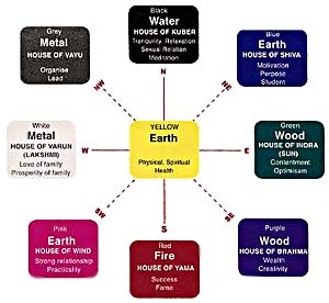
Colors in Vastu Shastra
According to Vaastu Shastra, the color schemes should conform to the raashi (constellation / zodiac sign) of the owner to bring good luck and happiness.
| Zodiac sign Aries Taurus Gemini Cancer Leo Virgo Libra Scorpio Sagittarius Capricorn Aquarius Pisces |
Colors suggested Coral red Milky white Green Rose red, pearl white Ruby red, dim white Emerald green Cement color, milky white Pink, coral red Golden yellow Dim red Pink, blue Yellow, pure white |
| Direction East (Sun) West (Saturn) North (Mercury) South (Mars) North-East (Jupiter) South-West (Rahu) South-East (Venus) North-West (Moon) |
Color suggested Shining white Blue all greens Pink, coral red Golden yellow all greens Silver white White |
Color contrast in value is perhaps the most important factor in a composition or a design. Maximum contrast is obtained by the use of colors of extremely strong chromes. A strong yellow on a black field is an excellent example of maximum visibility. A bright strong yellowish red would be considered as a powerful color. The color of an object depends upon the light it emits or sends back to an eye. Opposite contrast colors are quickly changed when it mixed as for black which makes colors both brighter and lighter in looks. Surrounding an intense color with a Grey increase the apparent colorfulness of the intense color making. It appears even brighter or brilliant. Surrounded by yellow, a Grey color may appear slightly blue. Surrounded by red, it may appear slightly green and surrounding by Grey with a bright color on other hand may influence the eye to discern in the greying of the complementary of the bright colors.
One must always bear in mind that no individual is completely white (good) or black (bad), but is an amalgam of the two Grey. A sensible good blending can create a forceful creation.
A particular color can activate or can control human glands by different bodily functions. Such as for good appetizer or to give excitement for the low blood pressure patient, a light limited soothing color atmosphere is recommended. Similarly Blue color is to stop overeating habits. For a high blood pressure patient, a light limited soothing color atmosphere is recommended. For quicker healing, green color is used in hospitals. For a good healthy, tasty food, golden yellow or tinted brown color is recommended.
Colors effect our body and mind very much. The purest and most thoughtful minds are those, which love, colors the most. The cool colors are blue sea or mainly blue in cast. The warm colors are red or mainly blue in cast. The warm colors are red and yellow in cast. Red make you feel gay while man can work best when surrounded by blue, but too strong blue or red cause depression. People often feel cold in blue room and warm in a red room. It is the color that makes them feel that way.
![]()
Er. Rameshwar Prasad invites you to the Wonderful World of Vastu Shastra
Engineer Rameshwar Prasad(B.Tech., M.Tech., P.G.D.C.A., P.G.D.M.) Vaastu International
|